Add the charts interactive element to your course
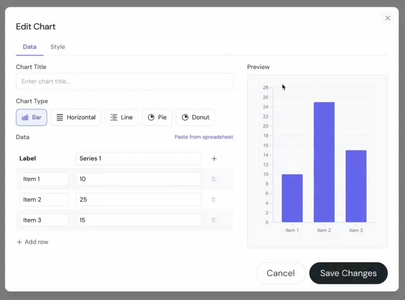
 Select Charts from the element list.
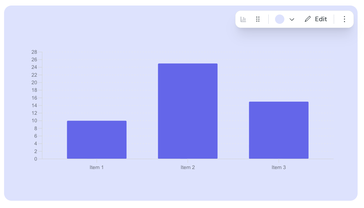
Hover over the component and click edit.
Enter the title for your chart.
Select the chart type you would like to use.
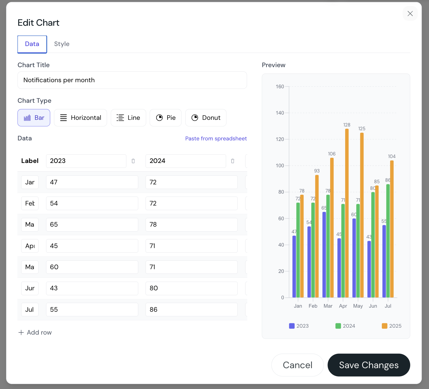
Manually enter the labels and series you would like to present in the chart OR click Paste from spreadsheet and past in the values to populate the chart.
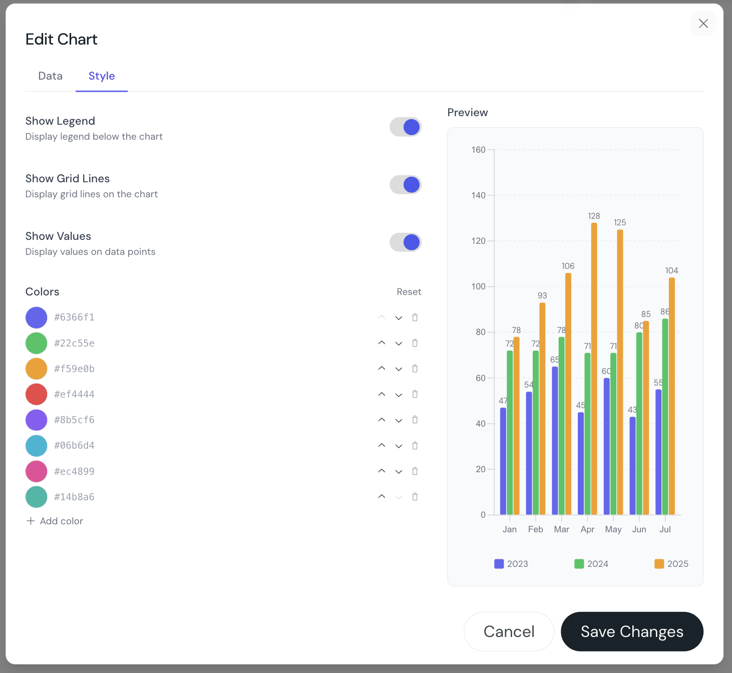
Once you are happy with the data presentation click the Style tab at the top of the modal to customise the colors of your chart.
You can:
Add as many rows and columns as you need.
Paste data that is formatted as a table using “Paste from spreadsheet”
Display data in a chart as: Bars, horizontal bars, lines, pie, or donut.
A view of the Chart component when first added to your course.
The data tab of the Chart component.
An example of the data tab when populated using “Paste from spreadsheet”
An example of the Style tab for a chart with data